Samsung Clinician Dashboard
Samsung Clinician Dashboard is an all-in-one portal that integrates with hospitals’ outpatient rehab programs and enable clinicians to closely monitor and provide care to their outpatients. I designed its home page - Overview tab to help streamline clinicians’ everyday workflow. The product won the Red Dot Design Award 2020.
Oct 2019 - Jan 2020
MVP shipped
My role: I owned the end-to-end design for the Overview tab: wire-framing, prototyping, UI/UX design, animation, overseeing the design implementation through closely working with engineering and QA teams.
Team: 2 designers, 1 researcher, 1 PM, 5 engineers


A product video I created to communicate our design and vision to multiple stakeholders.
DEFINING THE REQUIREMENTS
What will make of a meaningful Overview for clinicians?
My first task after I on-boarded the project was to build the Overview tab that will serve as the Home tab that users land on. We interviewed clinicians to learn about their daily work routines involving dashboards. A key insight arose from the interviews -
Clinicians expect the dashboards to help organize and prioritize their day among different tasks and actions.
This specific task-based mental model informed us on our design direction - rather than just displaying summary of information, we wanted to build the Overview as a place that help with prioritizing and decision-making. We started to define what are some of the important tasks and information that should be in the Overview tab, and arrived at the 4 categories below.
-
Administrative tasks
-
Review and dismiss alerts
-
Check today's appointments
-
Check overall stats of the patient population
I created a quick wireframe that helped us see how the Overview tab might look like with the task-based layout. Each section was dedicated to a different task: Reminders for admin tasks, Alerts, Appointments and Program summary.
Early wireframe - a task-based layout

We tested the the wireframe prototype with 8 clinicians to see their reaction and found 2 main challenges.
CHALLENGE #1
Matching to clinicians’ existing workflow
Feedback 01: Clinicians didn't like jumping between a mix of different tasks in the Reminders section. It required additional mental capacity for recognition and processing.
Solution: I further broke down the admin tasks to 2 sub-tasks - disenrolling patients from the program and marking appointment status. Along with alerts, the 3 tasks represented very different use cases so I explored different layouts and visual treatments to make that clear distinction.


Visual and layout experiments to draw clear distinction for each task
Feedback 02: The current alert design was not prominent enough and lacking contexts to help clinicians understand the different severity.
Exploration: I tried breaking down alerts to sub-categories to add clarity and distinction. However, this pushed down other information and would be hard to scale as alert types change.
Exploration - further break down alerts

We decided to reject this idea since it would be hard to scale.
Solution: After a series of explorations I landed on the final design below. Keeping the 3-card layout, I tried to apply icons, colors and different typography to create visual hierarchy and provide more contexts in each section, especially for alerts.

CHALLENGE #2
Presenting macro and micro-level information in an efficient way
Clinicians wanted to move fast in their workflow, they wanted less clicks and more information at a glimpse. Our design needed to provide clinicians with a snapshot of what’s going on with all the patients, as well as allowing them to dive deep into individual-level details whenever needed.
Initially, we tested out 2 approaches -
-
Idea 1: For each kind of task, have all the items in a scrollable card.
-
Idea 2: Only display up to 5 items in each type of tasks and show the rest in a popup when users want to view more.
However, we found that clinicians were having troubles with both approaches. With limited space and different information and actions, both the scrollable card and popup were difficult to interact with. As the number of tasks increase, clinicians also got lost in scrolling or among the pages in the popup.
Idea 1 Scrollable card

Idea 2 View all tasks in a popup

We moved away from the 2 designs after realizing the usability and scaling issues.
We iterated from Idea 2 by turning it into a separate page view - display only 5 items for each task in Overview and if users want to see the rest, they would go to a inner page. However, this idea didn't perform well as it went against clinicians’ need of ‘less clicks’. Jumping between pages costed them more time and broke their workflow.
Idea 3 Page view

Page View didn't work well because switching between pages was inefficient for clinicians
Drawing from the testing results on multiple iterations, it became apparent that our design has to meet the 3 needs below -
01. Easy to interact
The 'View all' mode should be a comfortable space for clinicians to view a large amount of information and take actions. Trying to cramp it into a small window or popup sacrifices usability.
02. Accessible and flexible
Clinicians should be able to easily enter and exit out of the 'View all' mode without breaking their original workflow.
03. Details in one click
As we added more details and contexts to alerts, it necessitated a detailed view for each individual alert.
Solution
We came up with 3 different views: a card layout in the Overview displaying up to 5 latest tasks, a popup displaying individual-level details, and an overlay that shows all the tasks. The 3 views helped clinicians quickly scan for the latest/most important tasks, dive into individual-level details whenever needed, and handle multiple tasks in an efficient way.
1. Card view - latest alerts

2. Popup view - individual alerts

3. Overlay view - all alerts

Through easily switching between different views, clinicians can handle a large amount of tasks in an efficient manner yet not missing any urgent and important information.
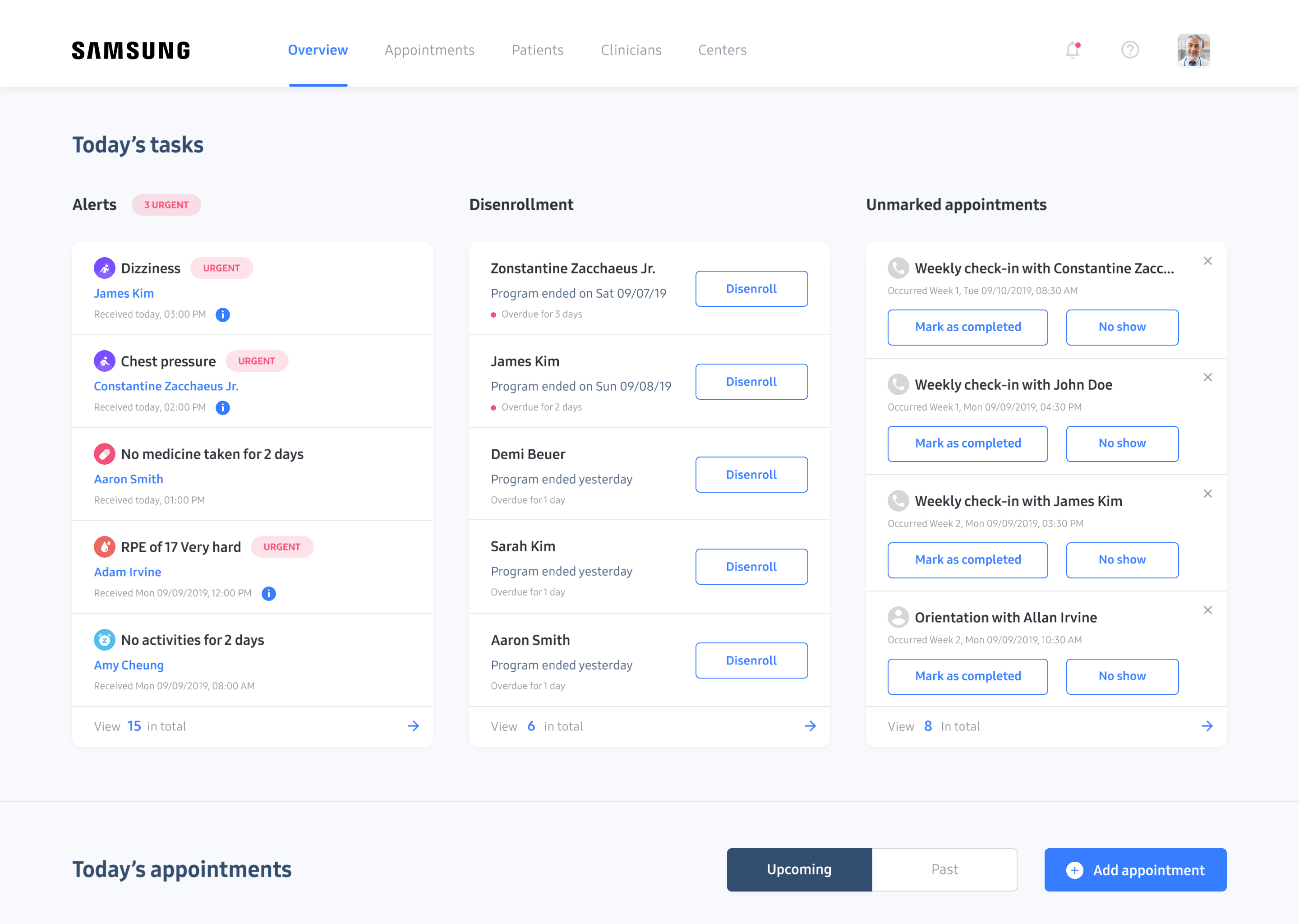
Clinicians can enter and exit out of different views effortlessly without breaking their workflow.
MORE ON ALERTS
Helping clinician provide timely and quality care
A clinician manage many patients and can get over hundreds of different alerts a day. How do we prioritize the alerts to ensure patients that need immediate attention will be seen first? Aside from sorting & filtering, we worked with medical experts in our team and come up with the ranking logics of alerts based on time and level of urgency. This helped us make sure that we displayed and prioritized the right information that could aid with clinicians’ decision-making.

I created a comprehensive logic chart for the ranking of alerts to communicate with engineering team.
Talking with clinicians taught us that medical documentation was critical - when reviewing or dismissing an alert, clinicians need to clearly document how it was addressed and the outcome for follow-up actions or future references. We went through a series of explorations with clinicians and finally arrived at a note-taking flow inside individual alerts.
A consistent design for the note section in different views.

Note section in individual alert popup.

Note section in 'View all alerts' mode.
Given the technical constraint that auto-save could not be implemented in our timeline, and the context that clinicians might be switching to different alerts in the 'View all alerts' mode and more likely to make mistakes, I thought through the entire note-taking experience and created designs that accounted for each interaction and state.

Different states for note.
AN AWARD-WINNING PRODUCT, CURRENTLY IN BETA
A clear and prioritized overview that makes assessment and action easy
I worked closely with engineers and QA team to oversee the implementation of our design. After nearly 6 months of development, our product is currently in beta and was awarded the Red Dot Design Award 2020. Even though we haven't gathered a lot of user data, we were really glad to hear positive feedback from clinicians as below.
-
The dashboard was perceived by clinicians as a comprehensive tool to help them monitor the health and compliance of their patients.
-
Clinicians found the Overview tab well organized and with sufficient information to help them make decisions and take actions.
