Samsung HeartWise Mobile App Redesign
Samsung HeartWise helps cardiac rehab patients complete their rehab program remotely using a smartwatch and a mobile app. I led the design initiative to revamp the user experience in the patient-facing app, with the goal to help with engagement and patient compliance.
Dec 2019 - Feb 2020
My role: Solo designer through end-to-end process: problem discovery, user research, prototyping, UI design, animation
Team: 1 designer, 1 researcher, 1 PM


DEFINING THE PROBLEM
Mismatched mental models and poor discoverability
We kicked off the project by understanding users' mental models of the current app. In a longitudinal study, we compared user's expectation of the app before the study began and their perception of the app after using the app for a month. The discrepancy of their answers was obvious.
Users' expectation of the app: "it tells me what to do and let me see where I am at, how much progress I am making."
Users' perception after using the app: "it's a place to view my past exercise data."

Design of the current app
We were surprised by how exercise-centric the app has become in actual use. In addition, users were not even aware of a lot of the features that the app offered. We further drilled down this discrepancy by looking into the issues of the current app design. Through synthesis from multiple user studies, we found that -
01. Medication and education were outshined by exercise with the current layout.
Exercise progress takes away the most attention on the screen, leaving users the impression that the app is just for 'seeing exercise'.
02. User's progress and status was hidden under confusing tab names.
The progress data is organized under the 'Week' and 'All' tabs. It's not indicative to the users what these two tabs contain and increases the exploring efforts.
03. Health data feature was de-prioritized.
Adding and seeing health data feature is mixed in different tabs right now and requires a long scroll to get to. With poor discoverability, the feature was overlooked.
BACKGROUND
HMW provide a more engaging mobile experience to help patients stick to their rehab routines?
As an important part of the rehab program, the mobile app plays a key role in helping patients stick to their rehab routines set by their clinicians. Patients are expected to use the app to -
-
Track their exercise data
-
Track their daily medications and complete education assignments
-
Track health data, e.g. blood pressure, weight, blood glucose
However, the app has been seeing little engagement since launch. Besides opening the app to make sure their exercise data is synced from their wearables, very few patients are using the other features that the app provides.
THE SOLUTION
Rethinking the mobile experience to help users navigate, discover and engage

A cleaner home that promotes and reiterate on rehab goals
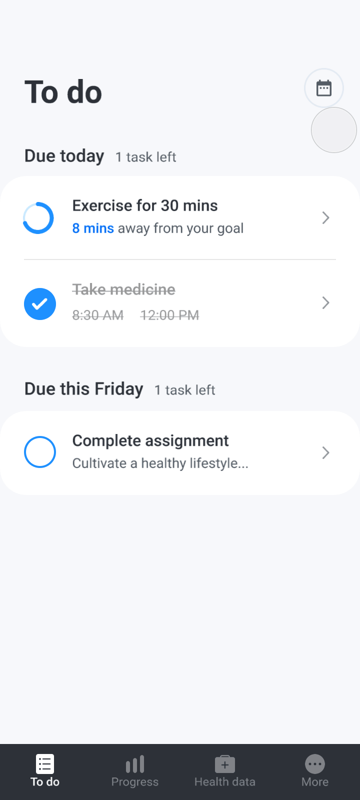
All of patients' checklist items including exercise, medicine and education are organized into a separate To do tab. With proper visual weight and removal of distracting elements, it increases the visibility of the important tasks and help patients see other rehab goals besides exercise.
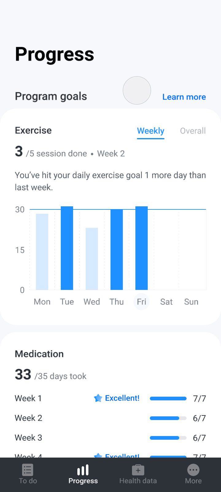
A Progress tab that informs patients of their current status and motivates them to do better
The Progress tab provides data, trends and insights on how patients are doing in their rehab program. By highlighting their progress towards each goal in the Progress tab, it strengthens patients' understanding of what they need to do and motivates them to do even better.

One place to easily track and view health performance
With more accessible graphs and clear CTAs, the Health data tab makes it easy for patients to record health data and track various health trends throughout their rehab program.
PROTOTYPING & ITERATING
Finding a intuitive IA and engaging layout
An overarching problem that emerged from our research was that the current information architecture was preventing users from finding things they need. I started to explore a different IA that would allow users to find information in an intuitive way.
From a series of explorations and testings, I landed on a bottom tab architecture, with the main tabs dedicated to user's daily tasks, rehab progress, and health data. A bottom tab design is also more thumb friendly and conventional to our user group.

Before

Initial concept
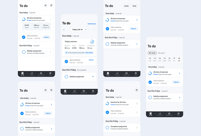
I started to imagine the layout and components in each tab, with the goals of improving discoverability, navigation and engagement. I used a card-based UI in the To do tab, which allowed users to see all of their daily tasks at once. To help users navigate and focus on the most important information, I tried to provide more clarity on the different CTAs and information labelling.

A quick mockup of the initial concept
Converging the team on one direction
Rebuilding the IA and revamping each tab is a big team commitment. Considering timeline and resources factors, I camp up with another concept that would require less dev efforts but might still mitigate the core issues. We ran another testing on the 2 prototypes along with the current design as the benchmark, in order to make sure what we were going to build was the most optimal solution.
We evaluated the design by -
-
User's task performance in each design: observe how well users do in each task in terms of navigating, discovering features, and comprehending the data.
-
Overall perception of the design: how did people feel about it? Did they want to engage with it?
Based on the criteria above, Concept A was the clear winner.
-
Awareness & comprehension of rehab goals: when seeing Concept A, users could clearly answer what they had left to do for that day right away.
-
Progress was straightforward and motivating: progress and status were found much faster compared to other designs. People were excited and motivated to see their progress.
-
Clear entry point for health data: a standalone tab for health data significantly increased its visibility, which were not seen in any other design and provided added value to users.
-
A more friendly and engaging look: with a simpler layout and more breathing room, Concept A was perceived as more friendly and pleasing to interact with.
Current design

A time based tab architecture that doesn't match with user's mental model and led to a crowded UI that harmed the discoverability of information.
Concept A

A task-based app IA with each tab dedicated to core features like daily tasks, progress and health data; Separation of features allowed more space for a more friendly design layout.
Concept B

A compromised solution: merged and renamed the current tabs to be more intuitive; adjusted the visual layout to avoid exercise being the sole focus.
Refining and pushing for usability and empathy
Moving forward with the Concept A direction, I decided to merge the last 2 secondary tabs into one because we got feedback that the number of tabs started to get overwhelming for users. I also applied a dark color scheme to the tab to increase its invisibility especially for our user group.
Initial concept

2nd iteration
01 Minimizing distraction in core tasks
Users' performance in the testing also indicated to us that there were too many competing elements in the To do and Health data tab, which increased exploring time and error rates. Our primary goal is to help users achieve their core tasks. Knowing that, I played with typography, icons and layouts, trying to highlight the most important tasks without sacrificing other secondary information and features.
Explorations for To do tab

Explorations for the Health data card
02 Celebrating patients' progress
Another question that we wanted to address in the iteration was what would be the best way to help users interpret their progress and be motivated. I explored different visualizations of users' status in the Progress tab, and also tried to incorporated more insights help celebrate users' achievement.

Different visualization ideas for user's progress
I ran the design iterations with the team to collect more feedback. Following our primary goal, even though each solution had tradeoffs, our priorities were set clear when evaluating the design -
-
Focus: The design should highlight the most important tasks/information and minimize distraction.
-
Discover: The design should improve the discoverability of different features and information, which requires clear labelling and CTAs.
-
Comprehend: The design should be able to assist users in comprehending data and information.
Based on the considerations above, we landed on the final design using a series of cleanly looking, consistent, and goal focused components below.
